It is often said that we eat with our eyes. In fact, according to Emerald Insights, people usually settle upon a decision within 90 seconds of an interaction with a product; between 62-90% of their assessment is based on colours alone.1 It has also been said that the first three to seven seconds after a shopper encounters an item on a store shelf are the most precious, a concept which Procter & Gamble describe as the “first moment of truth”.2
Commenting on colour in food and drink, international ingredients company ofi, told Food Manufacture: “Not only is it the first thing we see, but it also has a big impact on what we feel and experience. For example, reds, oranges and yellows are the shades frequently used by food brands, because they are known to excite the senses and make us feel hungry.”
Making an impression with colour is therefore a vital part of both marketing and NPD. So how do we utilise this knowledge to bring the very best product offer to customers and what colours should we be keeping a close eye on?
Social media gives a renewed focus on colour
“The importance of food colour cannot be overstated,” Philippe Bernay, Cargill’s EMEA commercial marketing lead, affirmed. “The concept that ‘you eat with your eyes’ is becoming increasingly relevant in the social media age, as sharing photos and videos of your food has become part of the culinary experience for many.”
Agreeing with Bernay’s views, Jeff Turner, innovation controller at cake manufacturer BBF Limited, noted the “considerable impact” social media has had on colour trends.
“This is something which is only going to continue in to 2023,” he said. “In fact, with the rise of TikTok videos and Instagram reels focusing on food trends and baking, we’re seeing new, eye catching shades of colour enter the bakery market. This trend is also seeing shoppers nationwide looking for products which are aesthetically pleasing.”
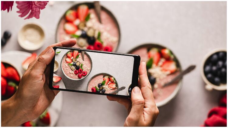
Oterra’s head of communications, Jessica O’Sullivan-Munck, also highlighted the influence social media has had – and will continue to have – on food and drink.
“Social media is all about visual impact,” she said. “Even in traditional supermarkets, 95% of our choices are based on the visual aspect of a product. Online, this rate is even higher, as we can’t smell or taste products, we can only view them in video or pictures.”
She continued that online is a place where excitement can be shared about a product, but equally criticism. The advantage of social media’s immediacy is that producers can take quick learnings and adjust their offerings.
“It is a dynamic environment that brings consumer and producer closer to each other, allowing a better understanding, faster turnarounds and the ability to anticipate better on future needs,” she divulged.
Bold colours hold promise for sweet treats
Looking specifically at confectionery and bakery, Bernay explained that visual appearance is an especially important attribute.
When it comes to cocoa and chocolate, Cargill’s research has revealed that more than half of EMEA consumers consider colour to be an important driver for their purchasing decisions.3 As such, this has been a key area where the company has placed focus.
Further insights gleaned from Cargill suggest that four out of ten consumers specify colour as a key factor in their bakery decision-making processes too.
Equipped with this knowledge, the ingredients giant has developed a range of chocolate and cocoa products to help brands create products that “capture the eye”. This includes its Bright White chocolate, which Bernay claims is the “first truly white chocolate on the marketplace”. Prior to this, he explains white chocolate was always more cream coloured.
“With Bright White, 92% of consumers rated it notably whiter than the white chocolate currently sold, and we’ve found that its stunning visual appeal has been a huge draw, providing an exciting canvas to bolster the visual appeal of all kinds of end products, including bakery, confections and dairy,” he continued.
White chocolate was also a product category that ofi flagged as “growing in popularity”.
Elaborating, the ofi experts told Food Manufacture: “Data from Information Resources, Inc. (IRI) shows that white chocolate sales grew 12 percent in 2021, compared to milk and dark chocolate, which were up nine percent. The light colour can be achieved with cocoa butter – the fat extracted from the cocoa bean that gives chocolate its distinctive flavour and texture.”
To cater for this upward trend, ofi has developed its deZaan Moonlight extra white cocoa butter, which allows producers to create confectionery coatings and fillings in a bright white colour.
Cargill has also focused on the other end of the scale, developing its Gerkens® BL84 Magnificent Black, the darkest addition to its Gerkens® cocoa powder portfolio. “It was developed specifically for the bakery space, where darker colours are associated with more intense flavour, better taste and considered more premium,” explained Bernay.
Mood boosters and nature
However, the overall theme for 2023 – at least according to Turner, is a feeling of reconnection with nature and mood enhancing tones.
“Every year, Pantone releases its colour of the year, which for 2023 is ‘Viva Magenta’,” he explained. “Viva Magenta is a shade of deep red that is rooted in nature. There is no doubt that nature will be a common trend in colours for 2023; with the new post-pandemic way of life, we are experiencing more of the outdoors than ever before and this is translating into many aspects of our lives, including bakery.
“Whilst Viva Magenta is Pantone’s colour of the year, we are also expecting to see pastels on the shelves nationwide in 2023, more specifically colours known as soft play pastels. The shades, including soft pinks, yellows, blues, mints and greens, are expected to create calming, nurturing and serene bakery experiences that invite people to reconnect with themselves and those around them.
“We have seen mood-boosting flavour profiles such as ‘sleep chocolate’ – which is chocolate mixed with comforting ingredients such as lavender and chamomile. Whilst this flavour profile may not appear starkly different in terms of colour, it adds to the overarching theme of feeling peaceful. Soft pastels may also be found on the packaging of such mood-boosting flavour profiles.”
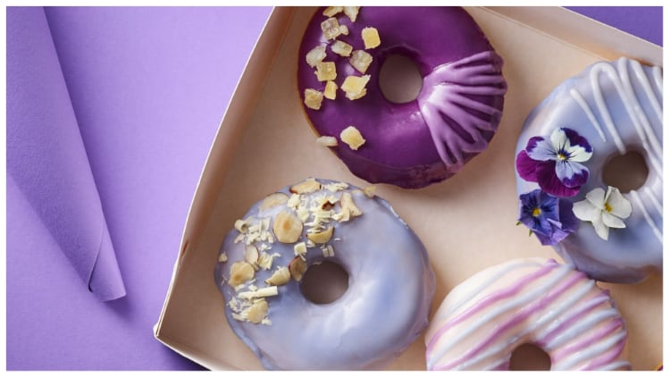
Blue, in particular, will be a colour we begin to see more over the comings years, Turner suggested, as a result of the mood boosting trend.
“The reason why blue is going to increase in popularity is that it’s thought to evoke feelings of calmness and relaxation.”
He continued: “When it comes to particular shades, a vibrant natural blue shade that is derived from spirulina – a type of blue-green algae that grows in both salt and fresh water - will start appearing on more shelves in 2023. Rich in vitamins and minerals, it is no surprise that spirulina powder is expected to be popular.”
Adding to these sentiments, O’Sullivan-Munck said: “When considering products to support people’s physical or mental health, it’s not only important that those products contain natural, or active ingredients. From our research we identified the importance of the psychology of colours and how important it is that they match the intended purpose of the product.
“In branding, colour psychology is already a well understood topic. Brands use colour to identify with a certain emotion or to emphasise their ideology. For food and beverage this is often overlooked and not fully understood, as we have historically neglected this and simply often mimicked the colour of the actual fruit or vegetable that the product is flavoured with.”
She explained that for food and beverages, which look to add value towards mental and physical health, it’s vital to match the colour with the specific purpose.
She offers an example: “In a time where people need affection and social interaction, shades from warm yellow to orange can support a more positive feeling. Especially in the darker winter days, it provides a sense of warmth and sunshine in the consumer’s mind while being friendly and energising. The colour will contribute to an overall more positive mental awareness.”
The impact wheat prices have had on natural tones
With wheat costs rising, however, Turner says that many farmers are now choosing to grow wheat over vegetables. This has had a knock-on effect as naturally produced colours are extracted from vegetables, which in turn are becoming more expensive due to lower supply.
However, he reassures that there continues to be developments across the sector which allow bakers and manufactures to find substitutes for the nation’s favourite shades, meaning it doesn’t impact what consumers are seeing in store.
Colours and function
Commenting on the psychological aspects of colour, O’Sullian-Munck said that identifying the main purpose of a product – with colour considered – during the early development stage will help avoid misalignment of function.
However, expanding on this further, she noted that although colour is often associated with a specific flavour profile and traditional consumers expect certain colours for certain flavours, an increasing trend of experimentation is being witnessed.
“Stepping away from the traditional fruit and vegetable flavours, producers can get more creative with ‘unicorn’, or ‘stardust’ or other ‘fantasy flavours’, engaging the consumer and driving the experience.”
The evolution of colour in food and drink
Previously, Turner said food and drink trends have been more about one prominent colour or a range of colours, whereas this year, the trends are driven more by “consumer needs and personal values”.
He attributes this evolution to the aftermath of the pandemic, which saw many reassessing their approach to physical and mental health.
“We’ve also seen that people are now turning to food and drink for moments of joy and escapism after the sensory deprivation that was lockdown. With this in mind, we expect ‘super sensory’ to become a trend for this year and into 2024, which will see shoppers looking for products which fulfil all senses – not just taste.
“As people are becoming more aware of price due to the cost-of-living crisis, they are looking to purchase products that look good and have an element of premiumisation, whilst still having an affordable price point. Most commonly, people are drawn to products that are colourful in their appearance and that are, of course, decadent in flavour,” he concluded.
As we see conflicting and concurrent trends dominating 2023, striking the right balance between the two will be crucial for producers.
References
- www.emerald.com/insight/content/doi/10.1108/00251740610673332/full/html
- https://sensientfoodcolors.com/en-us/wp-content/uploads/2017/02/sen17111_case_study_blogv6.pdf
- Cargill Proprietary Research 2022, 7000+ consumers across 10 EMEA countries


