News
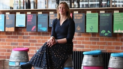
Adnams redesigns artwork across core beer range
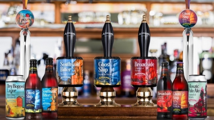
The new look will be rolled out across its kegs, casks, bottles and cans from 2 April, while two new beers will be added to its range.
Established in 1872, Adnams recently announced that it is exploring a range of funding options that will support its “future growth and provide additional resilience”. Meanwhile, the brewer named Jenny Hanlon as its new CEO on 28 March.
The new designs adorning its full range of brews has been reimagined by Adnams in tandem with Brighton-based design studio CookChick and local artist Vanessa Sorboen in order to reflect the brand’s Suffolk home. Each beer has its own unique painting, with each hoping to capture a true impression of the brewery’s East Anglian heritage.
Investment in cask was key to this project, and Adnams felt it was very important that the redesign encompassed a new and innovative offering for its on-trade customers.
Broadside and Ghost Ship 4.5% pale ale bottles will be the first to launch from 2 April, with the rest of the range to follow throughout April and early May. Meanwhile, the two new beers will launch on 4 April – Big Skies, a double dry-hopped IPA, and Deep Seas, a Belgian-style blonde.
'The new branding tells a story'
Fergus Fitzgerald, head of production at Adnams, said that the redesign came with two primary goals: “Firstly, it allows us to bring all our beers back under one unified look. Beers like Mosaic and Dry Hopped have been two of our core beers for a while and whilst having a different look made sense in the early days, bringing them together again reflects the fact that our brewers use the same great quality ingredients and the same skill and dedication when brewing a beer, regardless of whether the recipe comes from 1872 or from 2024.
“Secondly, the new branding really brings out that sense of place and connection to where these beers are made. The paintings tell the stories and showcase the beauty of the landscapes that inspired those beers. I hope that this reminds existing Adnams drinkers why they first fell in love with that beer, and that those who don’t know us so well see something in the waters to inspire that first sip.”
Meanwhile, senior designer at CookChick David Huckell said that the new designs aimed to help Adnams stand out in a competitive beer marketplace.
“With the Suffolk coast still serving as the centre point and heart of the brand, we have widened the lens to encompass a 360-degree view of the area, giving us a broader palette to draw from and setting Adnams apart from other breweries championing their coastal roots,” Hucknell added.
Working with Sorboen, CookChick was able to “capture the very intrinsic qualities of Adnams’ hometown – Southwold – and the surrounding Suffolk and Norfolk area”.
Reflecting on the experience, Sorboen explained: “Jess and the team at CookChick were fantastic at guiding me through what they wanted me to paint and where the features needed to be placed, to work alongside all the other elements that would appear on the final product. It all had to fall in a specific area. As someone who paints freely, to have to think of the components within the composition and consider perspective and how the scene wraps around the canvas, which in this case, is the beer can, bottle or pump clip – was an intriguing challenge.”
In other news, Morrisons posted a 4.6% increase in like-for-like sales during Q1.