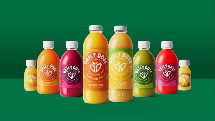
The drinks manufacturer said that the rebrand has been designed to better reflect its values of “quality, care and sustainability”.
The new visual identity was created in partnership with branding and design collective One Good Reason, and leads with a “refreshed, vibrant colour palette and sharper, confident typography”.
It is aimed at helping Daily Dose products stand out on shelf, hold its own among competitors and elevate its retail presence.
Daily Dose founder George Hughes-Davies said the rebrand represents more than a new look because it is a "new way of telling our story“.
“We’re still putting flavour and farmers first, still using whole fruits and veggies, and fighting food waste,” added Hughes-Davies.
“This has been a long time coming, and as much as I’m really proud of what we’ve achieved to date, this is a fresh chapter for us and it’s going to be an exciting one.”
Hayley Barrett, co-owner and executive creative director at One Good Reason, explained that the new visual identity was developed in close collaboration with the Daily Dose team in order to capture the “heart of the brand”.
“For us, it’s all about telling a strong, succinct story in the most compelling way - and we got there thanks to this great partnership,” continued Barrett.
“The result is a beacon on the shelf, powered by a clever idea that sparks a smile, dials up authenticity, and bursts with the vibrant energy of the natural world. We’re incredibly proud of the outcome.”
Daily Dose manufactures all of its juices at its factory in Corby, Northamptonshire, while it rescues unwanted produce from UK farms and turns it into juice.
The company is a certified B Corp and is forecasting to reach £20 million in revenue this year.


